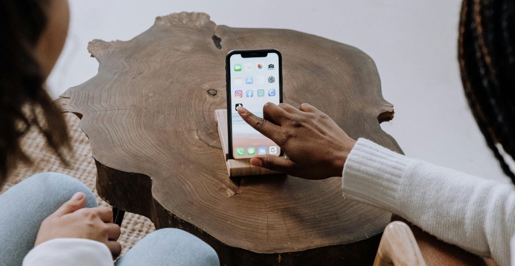
Motion design has become the invisible hand behind today’s best apps. This article gives an in-depth overview of how the current market leaders and emerging challengers use animation to create better user experiences.
What makes a great app is how it moves. Sure, functionality is key, but the top apps now feature smooth animations. From established brands to upstarts, the best apps all have animation in their design. Whether it’s Google’s Material Design or Signal’s minimalist style, motion is more than just eye candy. This gives them functionality, trust, and user engagement.
Today’s Top Apps and Their Effective Strategies
Leaders in app design emerge in the rankings in April 2025. Looks like Google Chrome is still the number one app overall, with Google right behind it. Among the free apps, Samsung One UI takes the third spot. The top apps show that good animations really provide longevity and help them remain popular. From shadows to transitions, everything here is designed to be familiar. Among emerging challengers, a few apps are really taking off:
- Life360: Stay Connected & Safe (Usage Rank 42, Store Rank 37)
- Ring – Always Home (Usage Rank 63)
- Signal Private Messenger (Usage Rank 77, Store Rank 111)
- Device Care (Usage Rank 80)
- theSCOOP (Usage Rank 86)
From communication to personalization, this ranking shows which categories could benefit from adapted animation strategies. For instance, Life360 is all about clarity for families with its location-tracking animations, and Signal is all about privacy with its minimalist motion. This diversity of approaches reveals one thing: you all know that people are different in their approaches. diversity is good. Animation needs to match the intent of an app.
Google’s Material Design Framework
It’s material design principles that guide the top apps on Google Play. Elevation and shadows create a visual hierarchy that makes interfaces feel tactile. The buttons actually lift up when pressed – real feedback. They also keep screens from being confused when a shared element like a profile icon moves from view to view.
The strength of Material Design lies in its consistency. And whether you use Chrome on Android or iOS, the motion language is familiar. That sort of cross-platform reliability may explain why Google continues to dominate. The system also gives priority to performance – animations will run at 60fps even on low-end devices. Google’s apps avoid the janky transitions of less polished competitors by balancing aesthetics with functionality.
ALSO READ: Using Digital Signage to Educate Customers on Vehicle Features
Functional Animation for Utility Apps
With Life360 (Usage Rank 42, Store Rank 37), you see how utility apps use motion to solve real-world problems. Location updates are smooth in the family tracker app – path animations move along paths instead of jumping between coordinates abruptly.
All of this gives rise to natural tracking experiences that resemble human movements in real life. So when a family member walks into a geofenced location, the app triggers a slow pulse animation that gets more urgent with time – low for routine alerts and loud for safety messages.
In some loading sequences, purposeful animations are incorporated with progress indicators that visually explain data refreshes. Wait times become informational moments because of visible progress indicators. Status changes such as “driving” to “stationary” fade slowly instead of flashing abruptly. All these little details make complicated information intuitive – motion design works even for big utilities.
Similar design tactics are shown in Ring’s security app, which uses animations to differentiate between routine doorbell presses and urgent motion alerts. For its live feed, it switches to a slightly zoomed effect, which gives spatial awareness without overwhelming users.
Privacy-Focused Apps and Minimalist Motion
The restrained approach of Signal Private Messenger (Usage Rank 77, Store Rank 111) fits its security-first philosophy. The app’s micro-interactions are measured and precise – message bubbles pop up just enough to confirm delivery without drawing attention. Screen transitions use quick linear animations to get users to their content faster.
Indicators for encryption employ small-scale animations to show changes in status. For instance, a lock icon might expand slightly when a chat is secure to indicate protection without interrupting the conversation. Even error states use soft shake animations to warn of problems without alarming users.
This discipline extends to notifications: barely perceptible motion alerts you to new messages while keeping the interface cool. In privacy-focused apps, less motion usually means more trust – users are not distracted by frills and can focus on secure communication.
ALSO READ: Why Professional Builders Are Essential for a Successful Construction Project
Why These Techniques Work
These top-ranked apps prove that animation has a purpose. Google’s Material Design provides a framework, but each app adapts these principles to its context. With Life360, tracking locations involves other motion strategies than with Signal or the theSCOOP. One of the basics of animation is storyboarding. Why should your app design be any different?
What connects the top apps is intentionality. Each animated solution solves one or another usability problem – for example, reducing anxiety during real-time tracking (Life360), establishing trust with minimal design (Signal), or making technical data approachable (Device Care). This serves to produce intuitive and responsive interfaces that increase user satisfaction and retention.
In an increasingly competitive app ecosystem, thoughtful design and motion animation are a necessity. The best apps communicate through motion, making everyday interactions pleasant experiences. In 2025, motion is no longer a fancy option for designers. It’s become the invisible thread that connects usability, trust and engagement.

